To left or not to left GNOME
I’m just another user who loves GNOME and suffers the blessing of its developers.
I’ve had the Close Button in the left since it was set by default in Ubuntu 10.04 and I liked it, and the button stayed in the left until GNOME 3.8.
GNOME 3.10 introduced Client Side Decoration (CSD), ie, now the application can paint the window border and buttons. Quoting from the linked site above:
A disadvantage of CSD is the inconsistency that brings between Apps that support them (mostly GNOME Apps) and Apps that don’t (3rd party Apps, like Firefox). However this is mostly in theory, because in practice, you won’t really be bothered from it.
A new widget called GtkHeaderBar was added in the process, and it was
decided that the GtkHeaderBar will forcibly put the Close Button in the
right, and then bug 706708 was filled, of course.
A fix was commited a month after the bug was filled and it entered in GTK+
3.10.3. Now I can set the placement of the Close Button again, so let’s
create a ~/.config/gtk-3.0/gtk.css with the following content:
GtkWindow {
  -GtkWindow-decoration-button-layout: "close:";
}
and see what happens.
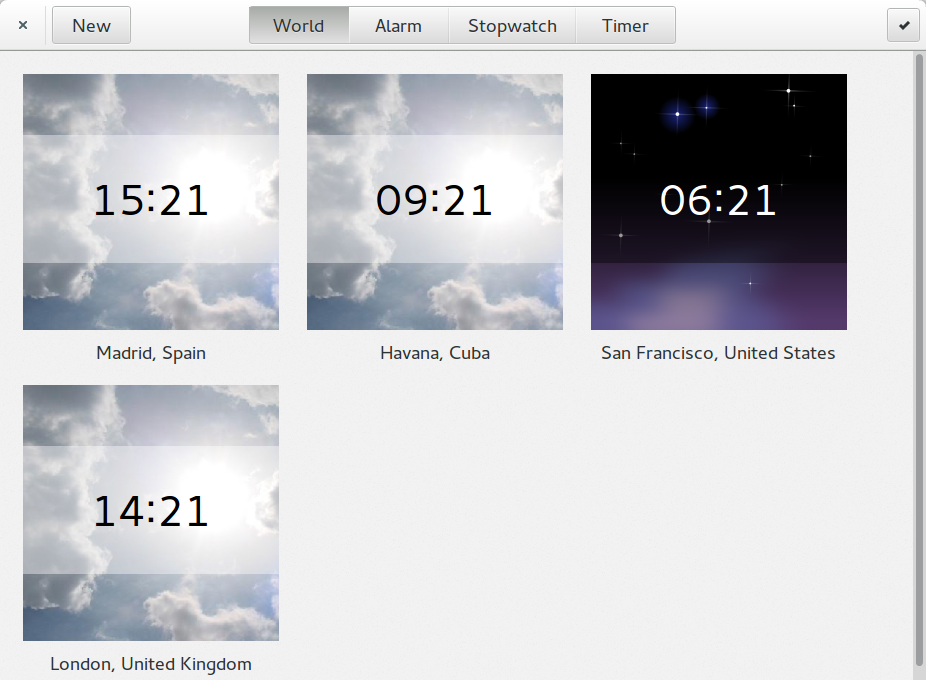
Clocks

this is gnome-clocks, honoring the setting.
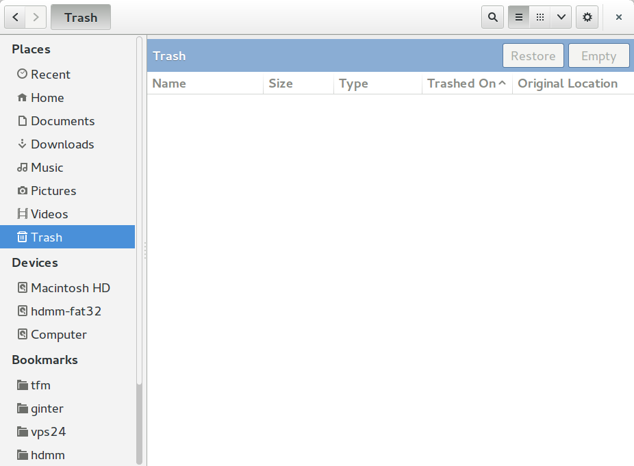
Nautilus

this is nautilus, not honoring the setting. It turned out that it isn’t
using a GtkHeaderBar after all. You can see in the source code that a
separator an a close button are added to the end of the top bar.
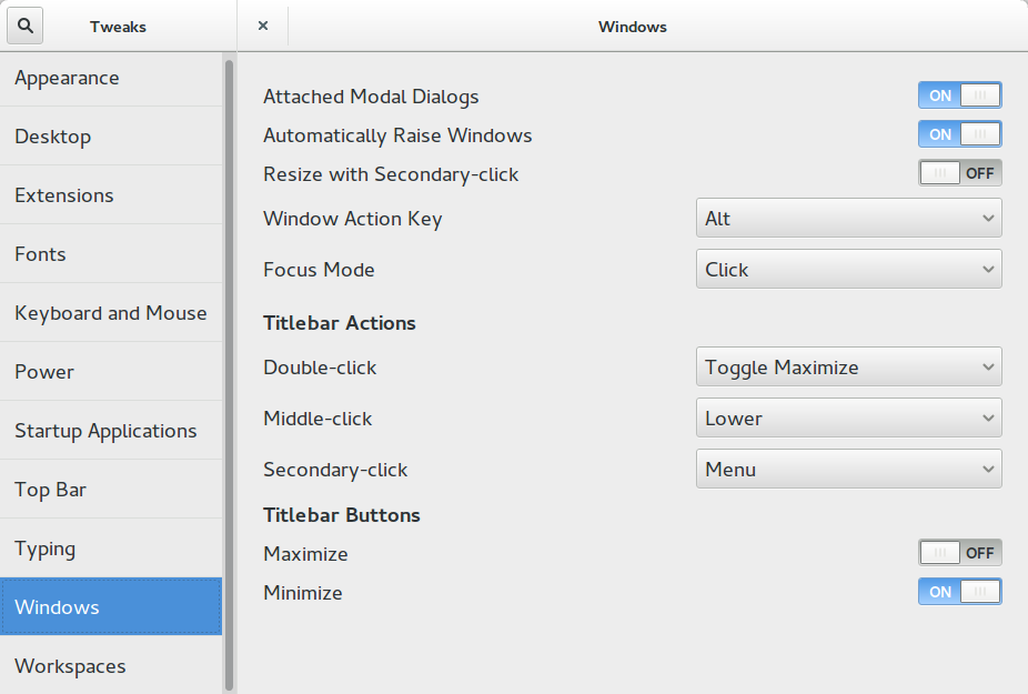
Gnome Tweak Tool

and this is gnome-tweak-tool, honoring the setting, only that it has two
GtkHeaderBar. The one to the left is not displaying the Close Button.
Inconsistency they said?